Isometric design guide
How to Create Isometric Illustrations
Isometric illustration gives a flat canvas a structured 3D look without perspective convergence. This guide focuses on the parts that matter in practice: axes, primitive construction, layer ordering, custom geometry, recognizable detail and export.
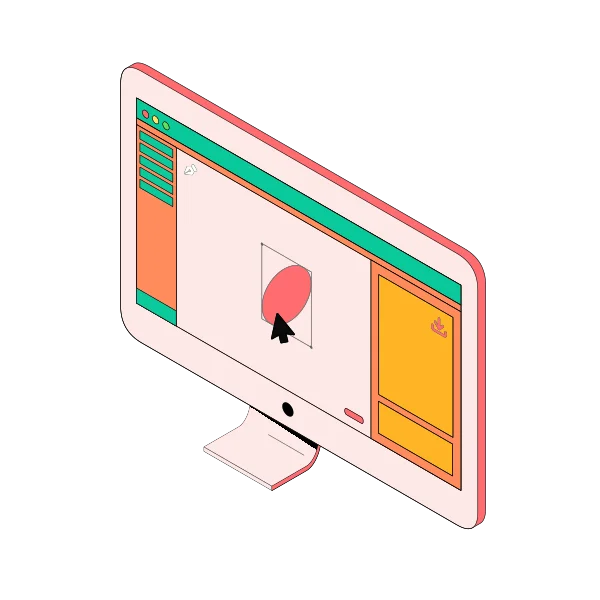
The basic geometry
In an isometric view, the three primary directions are treated consistently rather than converging toward vanishing points. Many digital workflows represent the two horizontal directions using lines at roughly +30° and -30°, plus a vertical direction. That structure makes it possible to build convincing objects from repeated faces and reusable shapes.
1. Start with the isometric axes
A common isometric setup uses two receding axes at about 30 degrees from the horizontal, with the vertical axis kept upright. The important part is consistency: parallel edges that represent the same world direction should remain parallel throughout the illustration.
2. Block the scene with simple primitives
Build the large forms first. Cuboids are useful for platforms, rooms, devices and buildings; cylinders cover wheels, pipes, containers and round controls; flat rectangles and circles help with panels and UI-like elements. Working from large forms to small ones makes proportion errors easier to spot.
3. Keep layer order consistent with depth
Layer order is one of the easiest ways to break an otherwise convincing isometric scene. Objects that visually sit behind another object should render first, while foreground details should render later. Group related parts so moving one object does not destroy the stacking order.
4. Build custom silhouettes only where needed
Do not manually draw every object. Reuse basic shapes for most of the scene and switch to a shape builder or pen tool only when the silhouette cannot be represented cleanly with primitives. This keeps the illustration editable and speeds up iteration.
5. Add recognizable details
Small details turn generic geometry into a specific object. A screen, lens, keyboard, chart, location pin or Wi-Fi mark often does more for recognition than extra 3D complexity. Use lines and text sparingly so the illustration remains readable at smaller sizes.
6. Use light and shadow consistently
Choose a simple lighting rule and keep it across the scene. Similar faces should use similar relative brightness, and cast shadows should follow the same direction. Consistency matters more than photorealistic lighting in most product-style isometric artwork.
7. Export for the final use case
Use PNG or JPEG when you need a quick raster asset. Use SVG when the illustration should stay sharp across different sizes or needs to continue through a vector workflow. Check the final result at the actual size it will appear on a website, deck or product screen.
 Isometric Wi-Fi Illustration
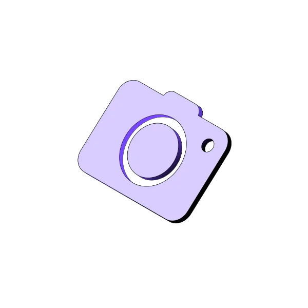 Isometric Camera Illustration
Practice with real isometric assets
Browse the illustration collection for references or download the free SVG pack. When you are ready to build a full scene, open the editor and combine primitives, custom shapes and layers.